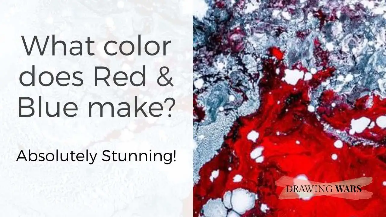
Red and Blue: An Introduction
What are your favorite type of colors? Are you more attracted to cool colors or do you gravitate towards the warm ones instead? Red and blue are primary colors that create a striking balance when you mix them. Even if you place them together, you can instantly catch how one color harmonizes the other. When we were learning color mixing, we couldn’t help but be astonished by how much we can achieve from primary colors. Yes, red and blue are primary - now let’s see what this actually means and what they create when mixed!
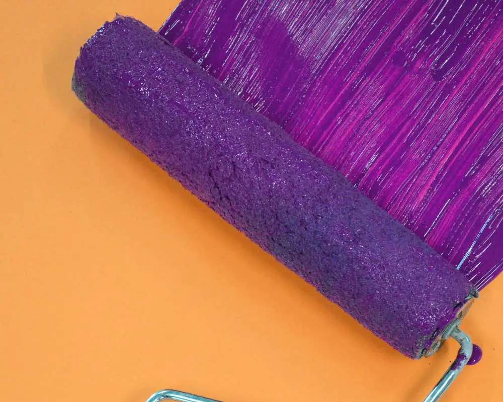
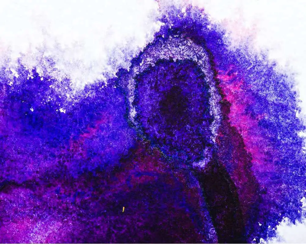
Mixing the primary colors red and blue will give purple. The resulting purple hue depends on the red and blue hues being mixed. If dark red is used instead of brilliant red, it would produce a more toned-down purple instead of a vibrant one.
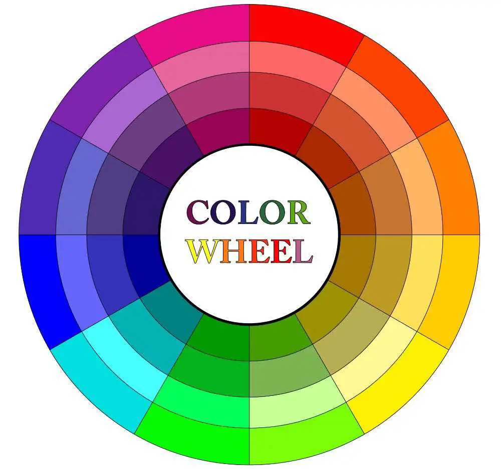
1. Understanding the Color Wheel and Color Theory
Purple is a mix of red and blue.
Red and blue are primary colors. Mixing red and blue creates a purple hue. The tonal values of this hue could be changed for a lighter or darker purple color. The third primary color is yellow, which is also the complementary color of purple.
Types of Colors
The primary colors are three: red, yellow, and blue. The hue of these simply doesn’t matter, because you can never derive red, blue, or yellow from any other color - and that’s why they’re called primary. When you mix any of these two, you get a secondary color.
Adding to the list, you get a tertiary color when you mix one primary color with any secondary color. So all in all, purple is a secondary color and if you mix yellow with purple, you’ll get a tertiary color - and most probably a brown or a grey since yellow and purple are complementary colors.
color wheel fact
complementary colors
On the color wheel, two colors that are completely opposite to each other are known as complementary colors. Mixing two complementary colors can result in a shade. So if you mix a bit of yellow with purple, you will notice the purple hue getting darker.
Creating tonal values
Tonal values are about the lightness or darkness of a hue. It is what helps create contrast in art and design projects. To create contrast, you would need neutral colors - namely white, grey and black. For some colors, brown hues could be used for creating tones as well.
Here is how you can create contrast:
Tints: You can create the ‘tint’ of a color by adding white to the particular hue. So if you’re adding white to a moderate purple hue, you can expect a softer, pastel version.
Tones: You can create the ‘tone’ of color when you add grey to the particular hue. It is perfect for adding moderate hues- neither light nor dark.
Shades: You can create the ‘shade’ of a color when you add black to the particular hue. Mixing black with purple would result in a dark purple, ideal for creating deep shadows and adding sharp contrast against purple tones.
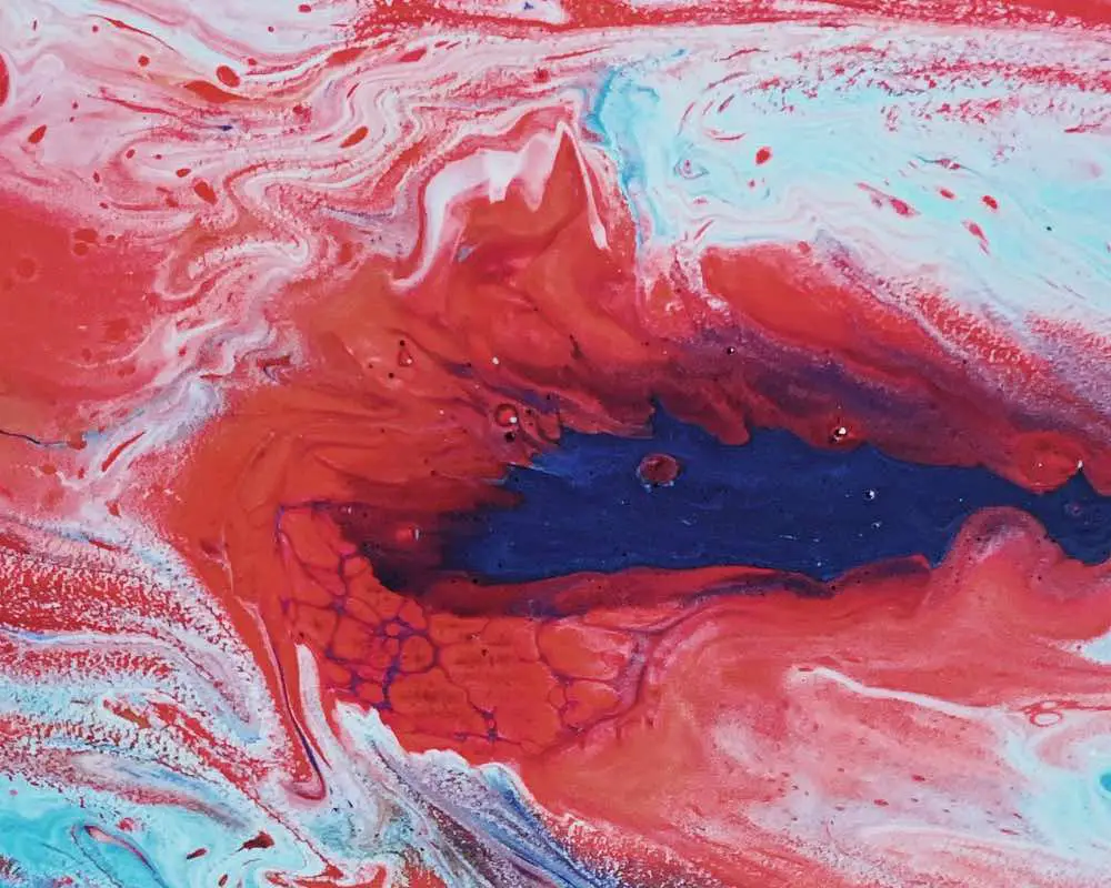
2. Creating hues of Purple using Red & Blue
Use various red and blue hues to get a variety of purple hues!
How can you use red and blue to get the purple hue you desire? Well, it’s all about noting the color temperature of the purple you get by mixing red and blue. If you make a warmer purple, the psychological effects will be that of red - bold, aggressive, and loving. Whereas if you make a cooler purple, the effects would be that of blue - calm, cool, and soothing.
What happens if you add more red to the purple mix?
Adding more red to a purple hue will result in a warmer purple . The warmth may vary slightly according to the warm or cool red you’re using.
Here are some hues of red you may have in your art kit:
- Scarlet red
- Brilliant red or basic red
- Alizarin crimson
What happens if you add more blue to the purple mix?
Adding more blue to a purple hue will result in a cooler purple . The coolness may vary slightly according to the how cool the blue you’re using is. While blue is naturally a cool color, adding a bit of a warm color such as orange (the complementary color of blue) may make it warmer.
Here are some hues of blue you may have in your art kit:
- Cobalt blue
- Cerulean blue
- Ultramarine blue
- Indigo blue
So if you add more blue, expect your purple hue to give cooler and calmer effects. And if you’re going to add more red to your purple, it would evoke a much warmer and creative feeling.
3. What is the color psychology of Purple?
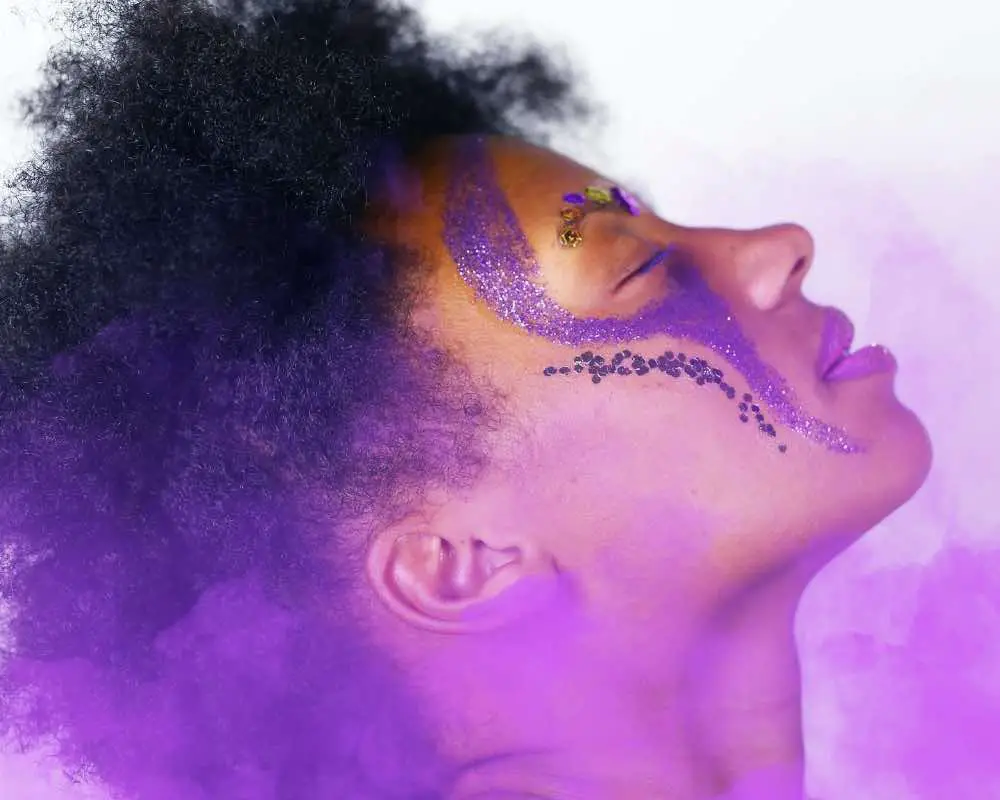
Purple is a mix of red and blue, so its effects are a mix of calm yet bold!
Let’s consider red and blue separately. When we look at red, we can feel love or outrage. The same goes for blue - you can feel both calm or even sad just by looking at it. However, the color psychology of red and blue
And the case is similar to purple. Since purple consists of both red and blue, its color psychology is intense. Imagine the amount of color psychology and emotional range you could portray just by using purple!
Do remember that culturally, the color could have different meanings. If it reflects royalty in one country or geographical region, it may portray bad luck in another. For instance, in Thailand, it is considered a symbol of loss and mourning.
| Positive traits | Negative traits |
|---|---|
| Creativity | Greed |
| Imagination | Irrational |
| Wealth | Suppressed feelings |
| Luxury | |
| Sensuality | |
| Spirituality | |
| Inspirational |
To learn more about how colors are connected to symbolism and different cultures, have a look at this guide .
4. How is Purple used in painting?
As a color, purple used to reflect royalty in the paintings of the old times.
In the era of classical painting, purple would be in high demand from royal families. It was a symbol of nobility, as a regal purple hue would traditionally be derived from cochineal. Since the process was very expensive and lengthy, only the noble class could afford it.
Although the modern purple pigment isn’t made by crushing insects, the symbolism and representation of purple in a painting pretty much remains the same.
Using purple in different painting media
-
Acrylics: The best part about using acrylic paints is that there is a diverse range of readymade colors available for artists. However, you don’t have to spend a lot of money on buying different hues. Simply get a warm and cool red, along with a cool blue. When you want to use purple, mix red and blue on the palette. Avoid mixing them directly on the canvas as acrylic paints dry very fast!
-
Oil paints: With oil paints, you can mix directly on the canvas as it’s easier. If you don’t want a straightforward purple hue, you can even place blue and red hues side by side to create an illusion of purple. This technique has been followed in oil paints by impressionists. With this technique, you can minimize your chances of getting the wrong purple hues and creating a mess out of your oil painting.
-
Watercolors: Watercolor is naturally transparent. While there are opaque ones available, the technique for basic watercolor is by adding one layer on top of another. In case you’re using opaque watercolor, it’s best to avoid the layering technique and mix the blue and red separately in the palette.
-
Gouache paints: Gouache has a creamy texture. It’s nothing like watercolor so don’t use it by adding too much water. If you’re confused about how to use gouache, read our post on getting the right water mix for gouache. For purple, we would suggest grabbing a basic purple and adding more red or blue as you desire.
If you want to get started with purple and have some harmless fun, look no further than this awesome vessel of Crayola Washable Tempera Paint .
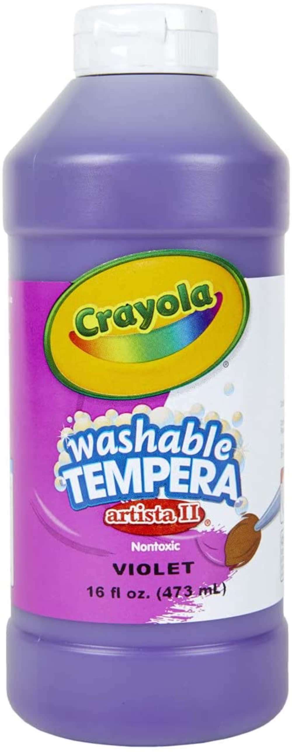
Crayola Washable Tempera Paint
This washable purple paint is ideal for kids. But if you've been looking forward to experimenting with purple, it's equally suitable for adults too.
![]()
Not a fan of washable tempera paint for kids? How about getting a bit serious with this professional watercolor paint tube from Daniel Smith ?
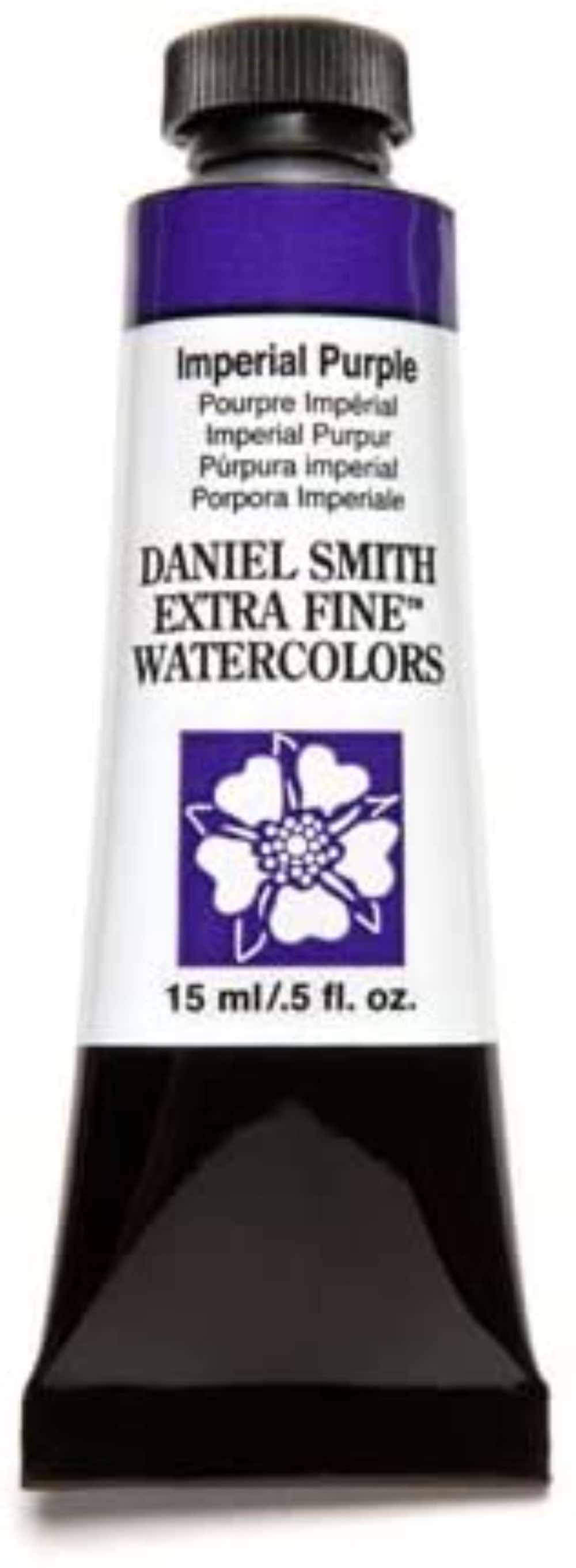
Daniel Smith (Imperial Purple) Watercolor Paint Tube
Daniel Smith watercolors are known for their professional artist quality. This small tube would be the perfect addition to any watercolor kit.
![]()
5. How is Purple used in drawing?
Both light and dark purple aren't that common in drawings.
Classically, purple has been used more for paintings rather than drawings.
Of course there’s no rule of thumb that purple can’t be used for drawings. It’s just the case that it hasn’t been commonly used for monochrome drawings, while you can find it more easily in multi-colored drawings and paintings. Now let’s go through a few tips on how to use purple in various drawing media.
Using purple in various drawing media
-
Chalks and pastels: It’s best to use purple pastels instead of mixing a purple hue using red and blue. The reason is fairly simple: Mixing colors in pastels and chalks can get very tricky. If you overdo it, you would end up with a muddy color.
-
Inks: Inks can come in many types - even in the form of watercolor. They could also be permanent, in which layering could be harder. Purple is always available separately in inks, so it’s best to purchase it as a standalone color. You can then add red or blue to make it warmer or cooler. But remember to never dip your brush directly in the ink bottle - it would get contaminated with another color! Always take out inks in wells, instead of using them directly from the pots.
-
Colored pencils: To get your very own purple hue, you can use the layering technique in colored pencils. Purple is available separately, and you would only need to blend with another colored pencil to create warmer and cooler purple hues or make tints, tones and shades.
-
Brush markers and pens: Note that when you’re using brush markers, you can get the darkest shade of purple by overlapping. Even if you’re using a light purple hue, with every extra layer it would create a darker purple shade.
Do you often find yourself daydreaming and doodling for fun? If yes, then we suggest you get this set of 4 Copic Doodle Art Markers - in purple hues !
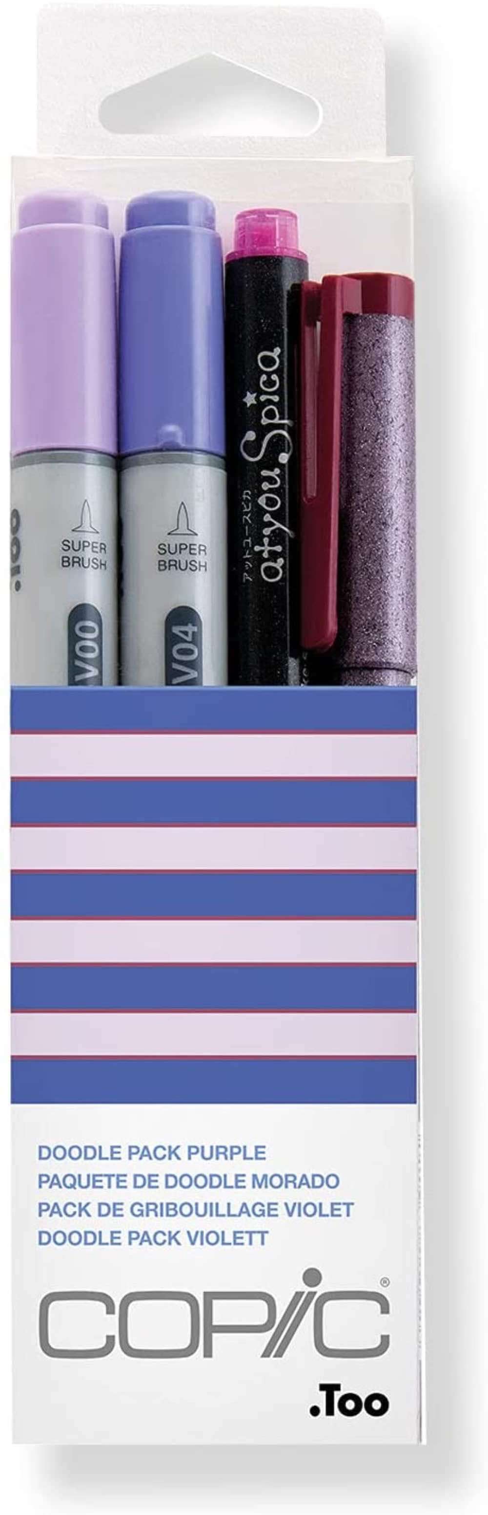
Copic Doodle Art Markers (Purple)
These are double-sided markers with 0.3 mm, medium-sized tips. Ideal for detailed works!
![]()
6. How is Purple used in design?
Purple can add an element of balance to any space or other design products.
Use purple in design when you want a well-balanced product or space.
In design, choosing the color scheme is easier said than done. But it doesn’t have to be that difficult either. And with purple, you have so many options because of how this beautiful color balances the properties of warm and cool colors.
Yes, you can use purple on its own! Its noble appeal makes it an excellent standalone color for design. However, it’s a flexible color so you can do a lot with it using some design skills.
Here are a few tips to successfully use purple in design:
- Purple can have an intense impact on any space. Combine white with purple for a more open atmosphere.
- For a sleek and sophisticated look, purple and gray make a serious yet elegant combination.
- For a bubbly look, add a bright saturated color if you’re using dark purple. Orange is a naturally vibrant color, for example.
PRO-TIP
add a metallic color or elements
Silver, bronze, gold, and similar colors have a touch of glamor to them. So they can make any space pop - whether you add them as dećor pieces or as a bit of paint here and there in multiple spots of any space.
Colors that go really well with purple
Without a doubt, purple hues are so diverse that you can create a striking monochromatic scheme. But monochrome designs aren’t always fun, so you need to know which colors look awesome with purple! If you’re looking for a more colorful and diverse purple design scheme, these colors look gorgeous with purple:
- Orange
- Baby blue
- Black
- Royal blue
- Brown
- Pastel yellow
- Light gray
- Red
- Turquoise
- Gold
PRO-TIP
tonal values
Remember that you can choose lighter or darker values in the colors that go well with purple. It all depends on how dark or light the purple hue is.
7. Some of the most common hues of Purple
Every hue of purple gives noble and regal vibes.
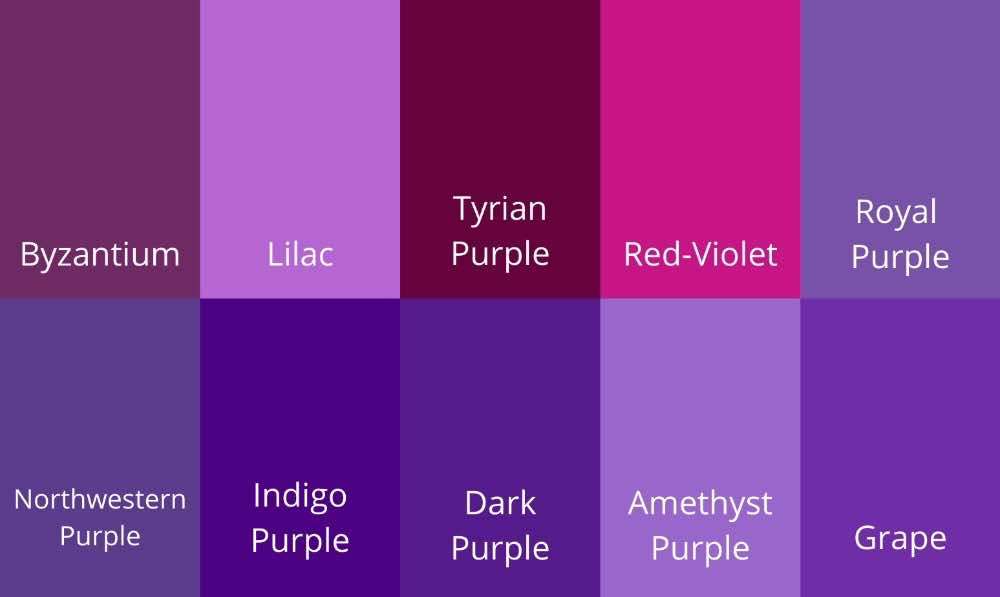
- Byzantium
- Lilac
- Tyrian purple
- Red-Violet
- Royal Purple
- Northwestern Purple
- Indigo Purple
- Dark Purple
- Amethyst
- Grape
Note that there could be many hues of purple. The above 10 are just a few common ones that you can use for your art and design work.
Conclusion
So when you mix red and blue, you can get a beautiful purple hue! You can add white, grey, or black to it to get tones, tints, and shades respectively. You could use the tints to create highlights, tones to create neutral contrast, and shades to add depth and contrast to an artwork. Psychologically, purple can evoke many emotions, from positive ones such as creativity, royalty, and spirituality to even negative ones like greed. In design, purple could make a royal standalone color but pairing it up with metallic elements like silver or neutral colors like gray, black, or white can add more contrast to a space.
Are you in love with color and want to explore more color mixing? We highly suggest you read about this awesome color created by mixing green and yellow !
What color does Brown & Yellow make? Absolutely Stunning!
As a neutral color, brown can add harmony to any art and design project. And yellow could brighten things up - so here's what happens when these two are mixed!

By Jimena & Iñigo
The Navarro-Rubios
My husband and I are learning how to draw and paint. We wanted to share this learning process with the world and have fun! That's why we created this blog. We'll have drawing contests every week and you'll decide who won that week! Follow along and learn with us!
Jimena & Iñigo
The Navarro-Rubios
My husband and I are learning how to draw and paint. We wanted to share this learning process with the world and have fun! That's why we created this blog. We'll have drawing contests every week and you'll decide who won that week! Follow along and learn with us!
Newsletter
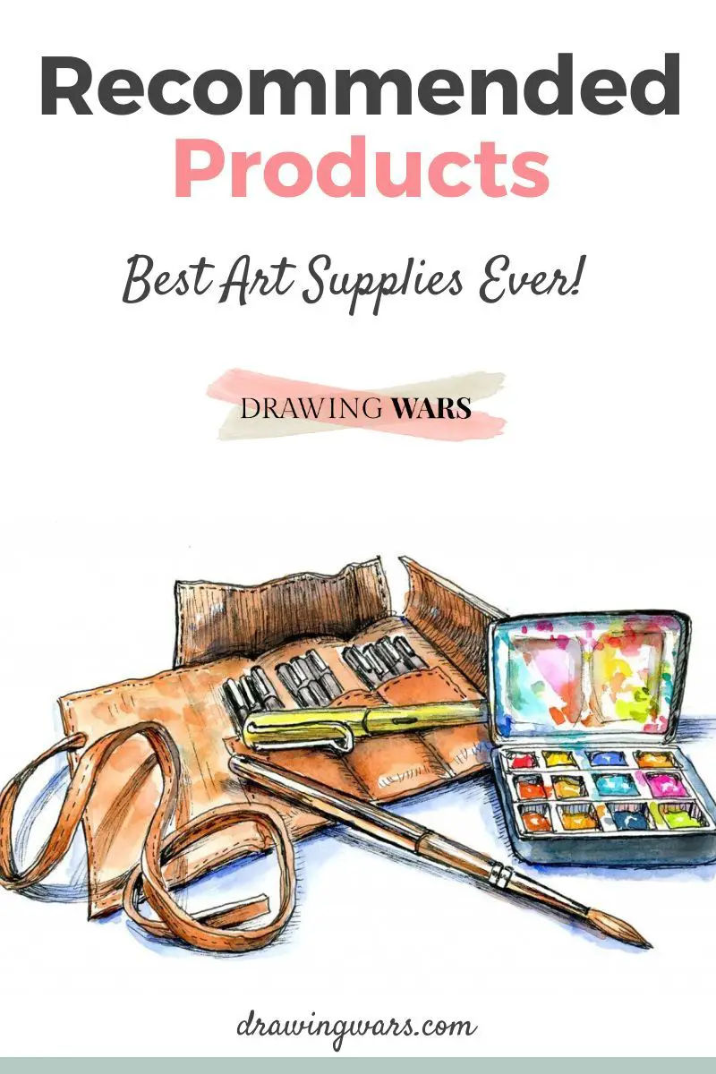
Recommended: