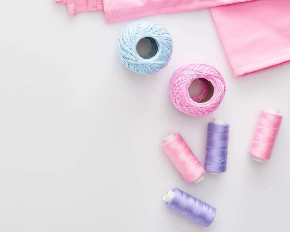
Blue and Pink: An Introduction
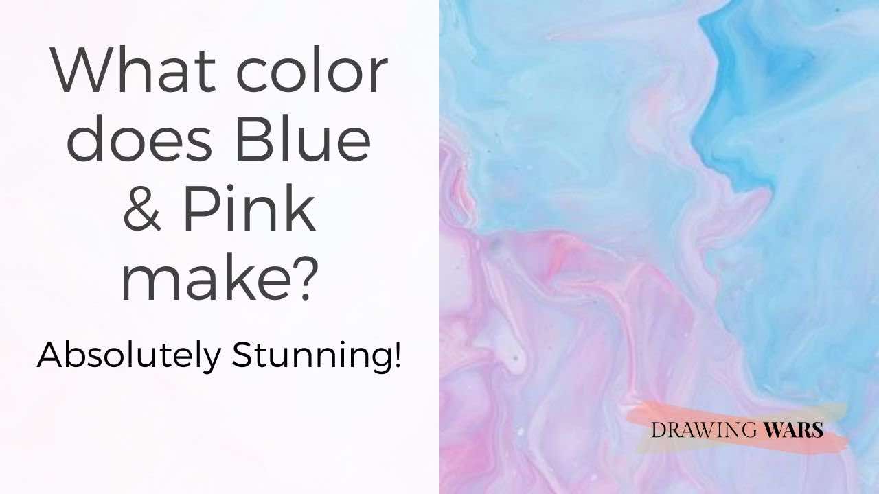
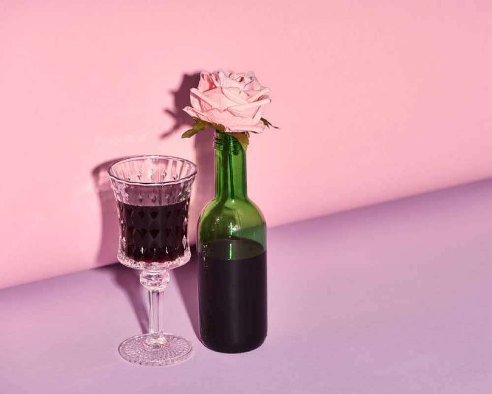
Don’t you just love blue and pink? One is cool, whereas the other gives such a cute and fuzzy feeling. And while pink is a red hue mixed with white, there can be many blue options to choose from. We love working with these two colors for our art and design projects that require a soft touch. Blue helps us feel calm and relaxed, whereas pink makes us feel playful and compassionate. So what happens when these two lovely colors are mixed?
Mixing the primary color blue with pink will result in pastel purple. Since pink is a tint of red (white mixed with red), it has the soft influence of the original color. Pastel purple has a softer influence and effect of the original purple color.
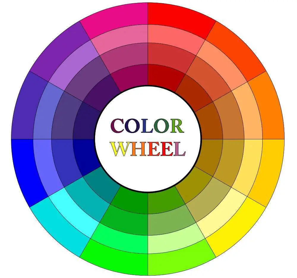
1. Understanding the Color Wheel and Color Theory
So where is pink or purple on the color wheel?
Purple is created by mixing red and blue. However, this purple is dark and on the cooler side of the color wheel. A pastel purple could also be derived by mixing white with this purple hue instead of using pink.
Types of Colors
Primary colors cannot be made from any other color and these three are: red, yellow and blue . You can get a
So purple is a secondary color and by mixing it with white, grey or black, you could get various hues of purple. For pastel purple, the only neutral color in play would be white.
color wheel fact
purple and color temperature
If there's more blue in the purple mix, the hue would be cooler. Adding more red will always result in a warmer purple.
Creating tonal values
Without tones, it’s hard to have contrast. But what do we mean by contrast and how is it created? It is when you play around with a certain color - make it lighter or darker. Here are the three basic terms you need to keep in mind, regardless of the color you’re using.
Tints: Adding white to a color creates its tint. This would result in a light color.
Tones: If you add grey to any color, you would get its ‘tone’. It is ideal for achieving mid-tones.
Shades: And finally, mixing black with any color would create its shade. You would be needing shades to add shadows and create subtle contrast!
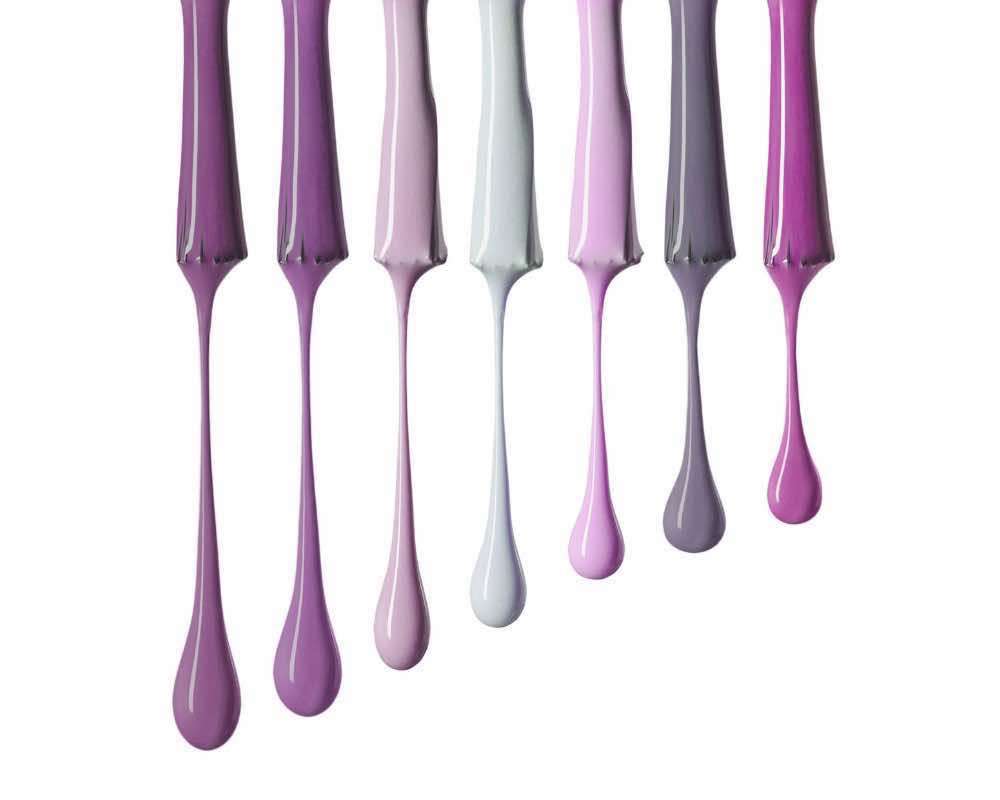
2. Creating Pastel Purple hues using Blue & Pink
Add more blue or pink and combine with neutral colors for a complete pastel purple palette!
How can you use red and blue to get the purple hue you desire? Well, it’s all about noting the color temperature of the purple you get by mixing red and blue. If you make a warmer purple, the psychological effects will be that of red - bold, aggressive, and loving. Whereas if you make a cooler purple, the effects would be that of blue - calm, cool, and soothing.
What happens if you add more blue to the pastel purple mix?
If you add more blue to your pastel purple mix, you would make it cooler. It would also mean that this pastel purple would have more of the psychological effects of blue rather than that of pink.
Here are some hues of yellow you may have in your art kit:
- Ultramarine blue
- Cobalt blue
- French blue
What happens if you add more pink to the pastel purple mix?
Adding more pink to your pastel purple would result in a warmer purple hue. It would be due to the presence of red (since pink is a mixture of white and red).
So here are some red hues you can mix with white to achieve pink:
- Cadmium red
- Scarlet red
- Alizarin crimson
3. What is the color psychology of Pastel Purple?
You can expect both relaxing and slightly playful effects with pastel purple!
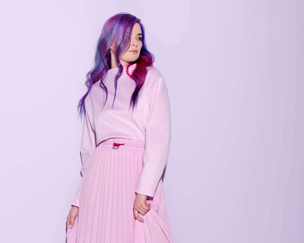
Pastel purple is made up of blue and pink. So when we think of blue, we could visualize the vast oceans, seas and the skies. Thinking of any of these makes us feel relaxed and calm. Whereas with pink, you could expect a similar soothing effect but toned down because it’s extremely soft.
So pastel purple is all about light heartedness and romance. However, it could symbolize pop culture as well, since they are full of fun colors. If you want to learn more about how colors are associated with culture, read about it here .
4. How is Pastel Purple used in painting?
Purple reflects royalty and pastel purple is the same, but more playful!
It all depends on the kind of painting you wish to create. As an artist, the paint you use needs to be aligned with the feelings you wish to evoke in your viewers. Pastel purple is the best for romantic and sensuous paintings. The original purple pigment used to be derived from cochineal insects, so it would be very expensive. But in the modern world, both purple and pastel purple could be achieved easily.
Here’s how you can use pastel purple in various painting media.
Using pastel purple in different painting media
-
Acrylics: With acrylics, the best way is to make your own purple. The most basic acrylic paint kit has the red and blue you would need to create a purple. And with white, you can instantly create a pastel purple. Alternatively of course, you can create the pink first and then mix it with blue.
-
Oil paints: If you are a beginner in oil paints, you may mess up color mixing. Mixing oil paints (regardless of color) usually ends up in a muddy tone. It could get tricky so we suggest you get a separate oil paint tube for purple and then simply add white to it. To give more range to your pastel purple hue, you could then add blue or a mix of red and white separately.
-
Watercolors: It’s best to use a pink watercolor paint tube or pan directly. Otherwise, you may have to dilute red separately to tone it down or perhaps blend it with white watercolor paint.
-
Gouache paints: Pastel purple can look absolutely gorgeous in gouache paints! But for a lighter shade, you’ll have to create a purple that’s a bit darker because with gouache paints, dark colors dry lighter and light colors dry darker.
If you’re looking for a watercolor kit that’s of great quality and affordable too, get this one from Winsor & Newton .
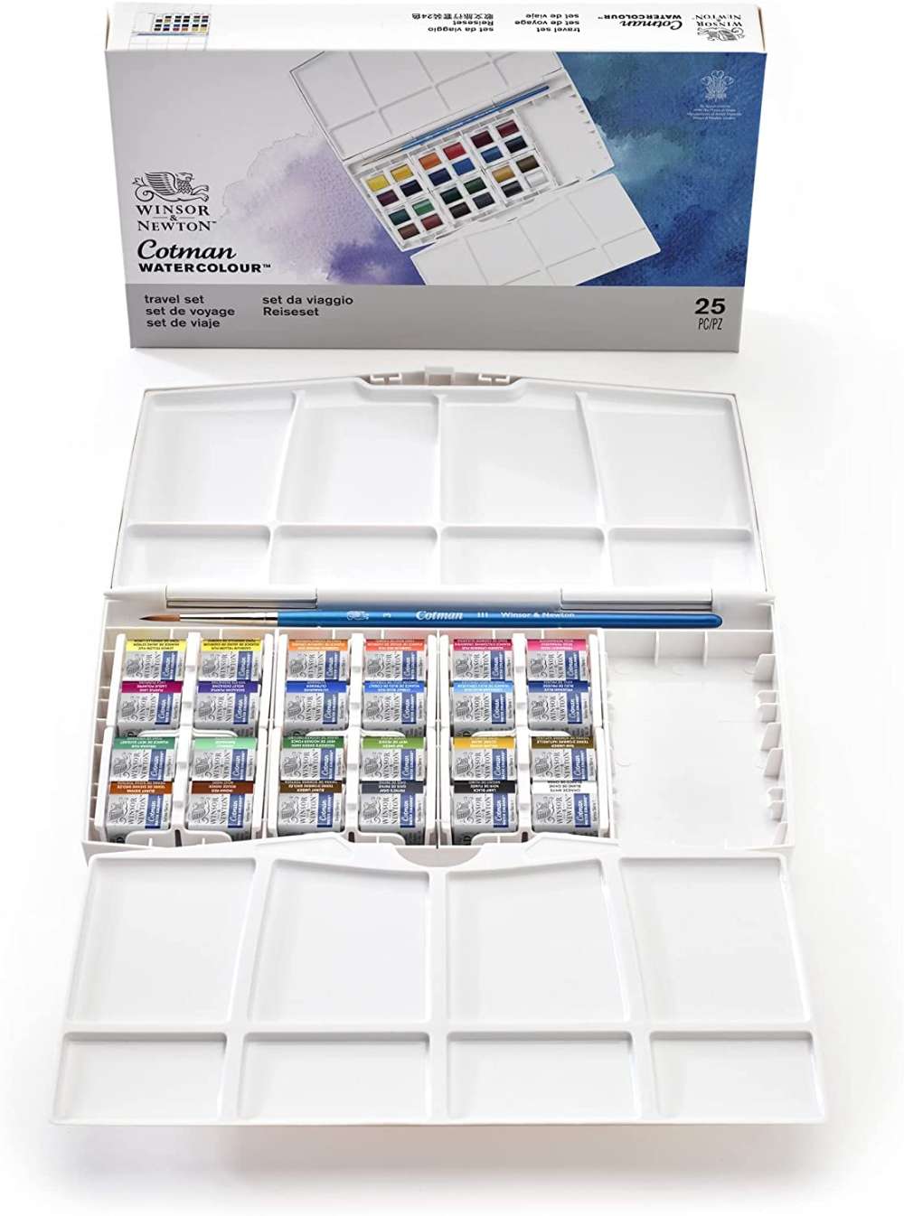
Winsor & Newton Cotman series (half pans)
This set of 24 watercolor half pans from Winsor & Newton has sufficient shades to help you get the best pastel purple!
![]()
5. How is Pastel Purple used in drawing?
The best drawing media for pastel purple are chalks and pastels.
In drawings, pastel purple could be hard to use in any medium other than pastels and colored pencils.
Pastel purple is extremely light and usually makes an excellent backdrop for drawings, just like in paintings. Essentially, it’s easier to achieve the blending or using the color directly in colored pencils or pastels. In inks and brush markers, it could be hard to go lighter. And the best way to do that would be to dilute the inks and for brush markers, keep the pressure light as you apply a pastel purple on the surface.
6. How is Pastel Purple used in design?
Use pastel purple to soften the mood and setting of any space.
Using pastel purple in spaces that look too serious and harsh.
With purple, the design scheme could be very diverse. However, with a pastel purple hue, things could be different. Purple is a bold color and its pastel version
To make the most of pastel purple in design, keep these three tips in mind:
- If you want to make a space look more open than ever, use white along with pastel purple.
- Use other pastel hues like pastel blue and pastel yellow for a pop themed space.
- Create a monochromatic color scheme with other pastel tints, tones and shades.
7. Some of the most common hues of Purple
What other hues of purple can you play around with?
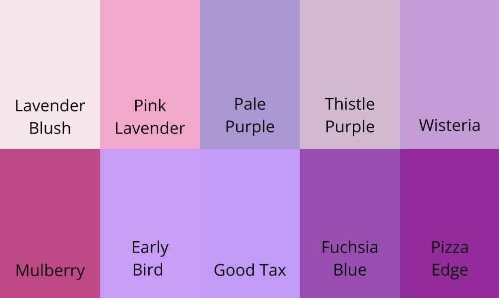
- Lavender Blush
- Pink Lavender
- Pale Purple
- Thistle Purple
- Wisteria
- Mulberry
- Early Bird
- Good Tax
- Fuchsia Blue
- Pizza Edge
You can use some of the above common purple hues for a monochromatic purple color scheme in your art and design projects.
Conclusion
So mixing blue and pink will give you a beautiful pastel purple! You can then lighten or darken it as you please, by using white, grey and black respectively. It would help create contrast in both artworks and design projects. Psychologically, pastel purple has a much softer impact compared to its original bold purple hue.
Do you wish to explore more colors or learn more about purple? We suggest you read this post on the color mixing of red and blue !
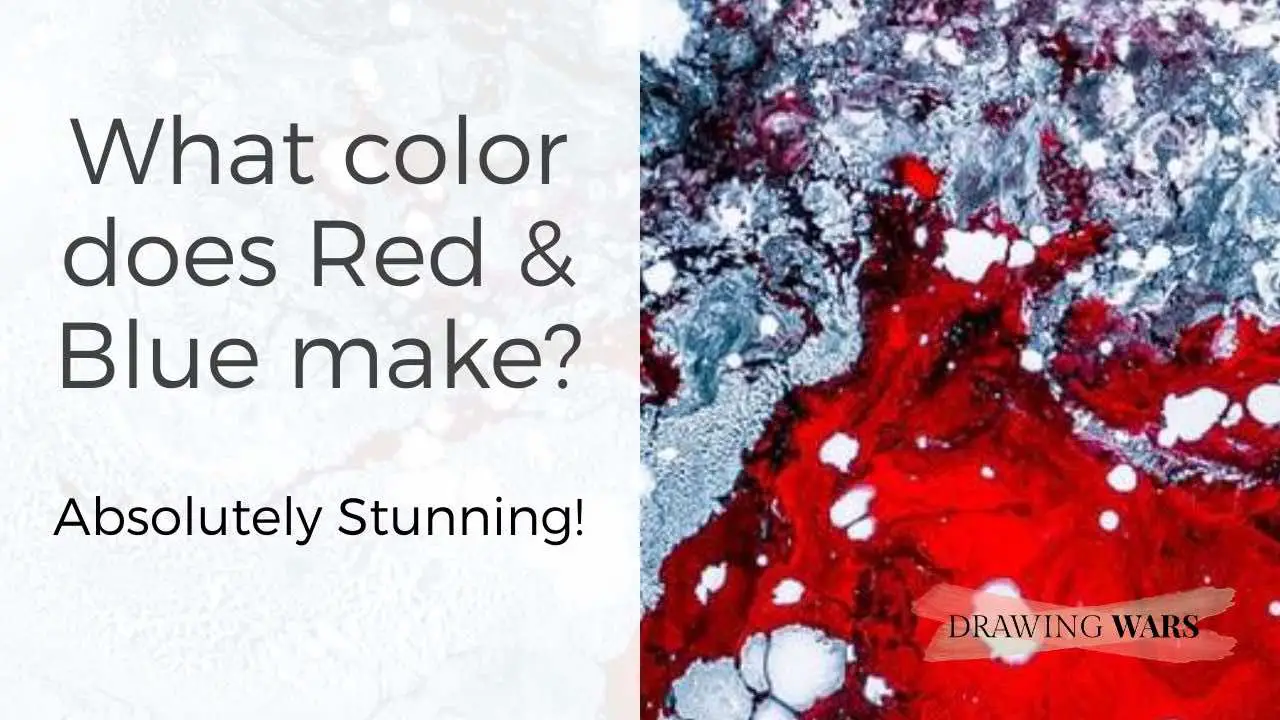
What color does Red & Blue make? Absolutely Stunning!
Red is as powerful and strong as blue is calm and cool. And when they're mixed, they create this beautiful hue - have a look at it!

By Jimena & Iñigo
The Navarro-Rubios
My husband and I are learning how to draw and paint. We wanted to share this learning process with the world and have fun! That's why we created this blog. We'll have drawing contests every week and you'll decide who won that week! Follow along and learn with us!
Jimena & Iñigo
The Navarro-Rubios
My husband and I are learning how to draw and paint. We wanted to share this learning process with the world and have fun! That's why we created this blog. We'll have drawing contests every week and you'll decide who won that week! Follow along and learn with us!
Newsletter
Recommended: