Introduction
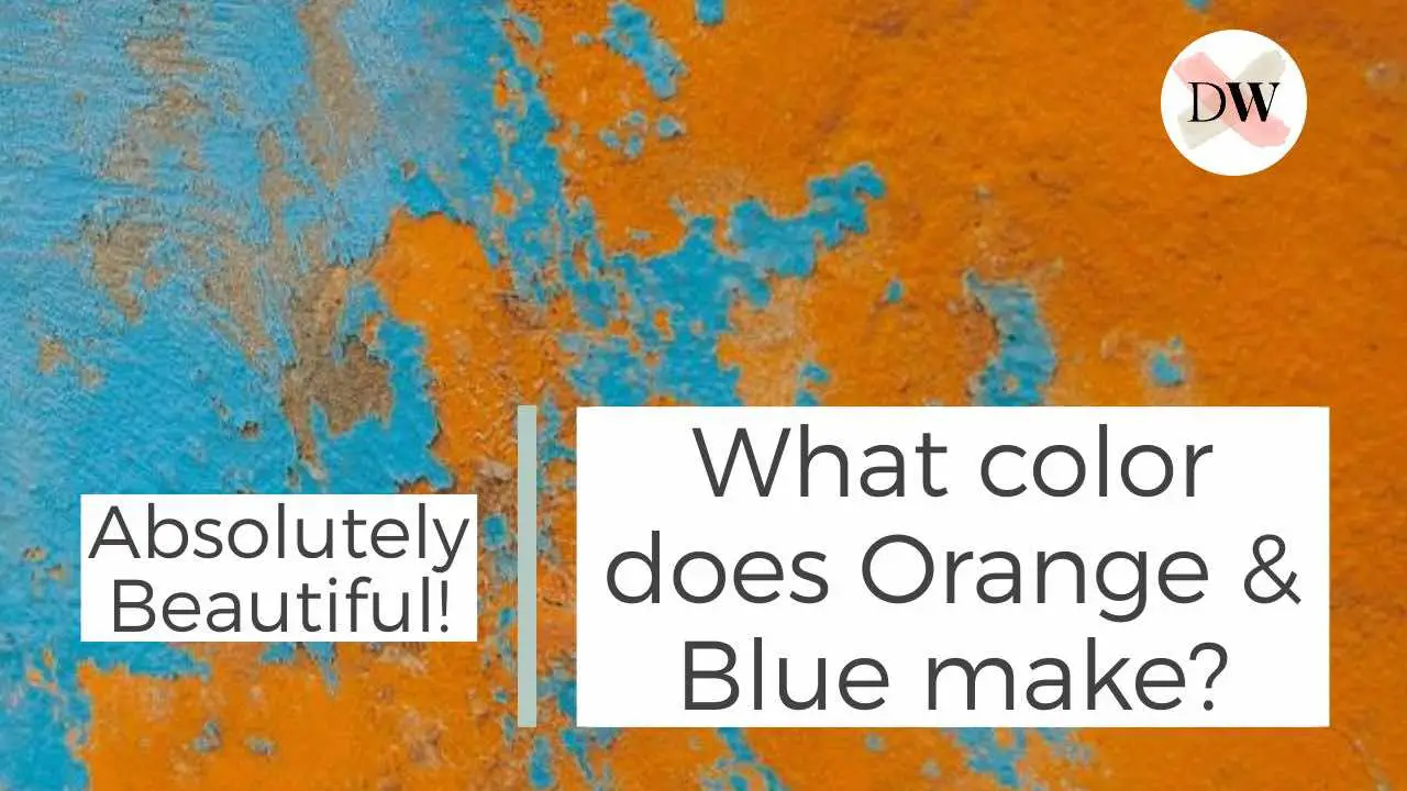
What is art without color? Even white and black have their roles to play, after all, they give us monochromatic artworks, tints, and shades. However, when we enter color, it’s all a big game of mixing. When we first started painting, we would use paint straight from the tube and avoid mixing color out of fear. But then we came across color theory and started practicing mixing. It wasn’t long before we mixed the warm color orange with the cool color blue - two colors with inherently opposite nature. And the result was absolutely beautiful!
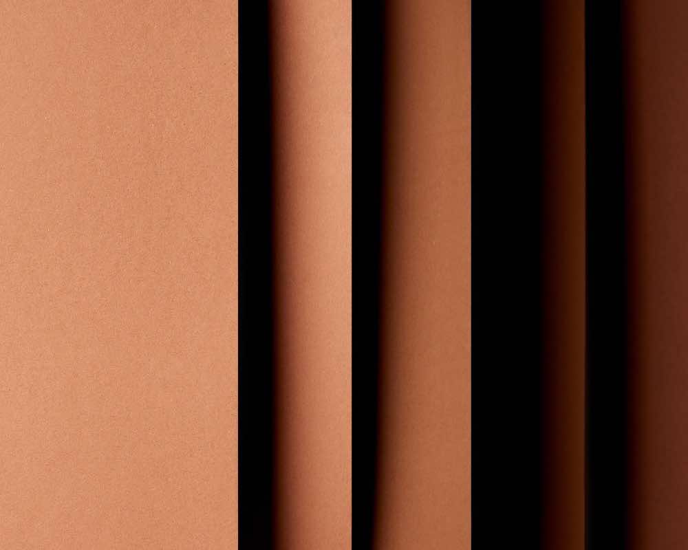
Orange and blue are mixed to create a hue of brown. The shades of orange and blue may vary but the resulting color will always be a certain version of brown. For instance, vermilion with royal blue, cadmium orange with sky blue, will give distinct brown hues.
1. Understanding the Color Wheel and Color Theory
Neutral colors like brown don't appear on the color wheel but they can be produced using it!
Brown is a neutral color that can be produced using any two colors that are opposite to each other on the color wheel (also known as complementary colors).
The color wheel is primarily made up of two color categories: warm colors and cool colors. Orange is a warm color, whereas blue is cool. Although you can always make an orange cooler and a blue warmer, the temperature of both these colors is an inherent characteristic.
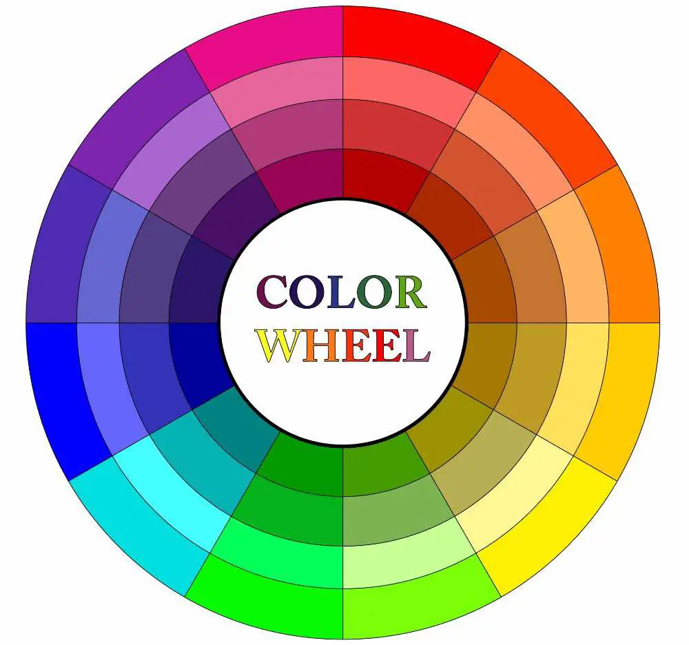
Type of Colors on the Color Wheel
- Primary colors: The three colors are red, yellow, and blue. Using them, you can create a variety of secondary colors, which can then be used to create tertiary colors.
- Secondary colors: You can create secondary colors by mixing primary colors. These include orange, purple and green.
- Tertiary colors: When you mix one primary and one secondary color, you will get tertiary colors.
- Complementary colors: Any two colors that are exactly opposite to each other on the color wheel are known as complementary colors.
Where is brown on the color wheel?
Since brown is a composite and neutral color, you will not find it on the color wheel. However, you can create it by mixing complementary colors and even using the primary colors - red, yellow, and blue.
2. Creating alternate shades of Brown Using Orange and Blue
Mixing any shade of orange and blue will give you a particular brown.
Brown is created by mixing orange and blue. The particular shade of brown can be altered using varying tones, tints, and shades of oranges and blues.
The shades of orange and blue may vary but the resulting color will be brown at all times. For instance, vermilion with royal blue, cadmium orange with sky blue, will give alternate hues of brown.
What happens if you add more orange to the mix?
Adding any shade of orange to the mix will result in a warmer hue of brown. You can then add white to create tints or black to create shades of the resulting orange hue. You can even use another color in little proportion to make the
What happens if you add more blue to the mix?
Adding any shade of blue to the mix will make the brown cooler. It doesn’t matter if you add white or black to lighten or darken the brown, it will portray a cool atmosphere.
PRO-TIP
the shades of blue
Do keep in mind that there are many shades of blue. There are warmer blues and cooler blues. Whatever you add to the mix, the temperature of the final brown depends on it.
3. The Color Psychology and Effects of Brown
Regardless of the shade, all shades of brown have shared psychological effects.
Since brown is an earth color, it shares characteristics with nature.
Below are a few feelings that any shade of brown will evoke. Since it is an earthly color, any shade of brown will create a natural and soothing feeling. It’s a color that is ideal for both personal and professional settings because when added to anything, it improves the quality.
| Positive traits of brown | Negative traits of brown |
|---|---|
| Strength | Sadness |
| Reliability | Loneliness |
| Security | Isolation |
| Safety | Heaviness |
| Dependability | Dullness |
| Hardworking | Boredom |
| Industrious | Poverty |
PRO-TIP
Keep the shade light
Using dark brown can evoke more sad feelings than lighter shades. If you want to reflect the positive traits of brown, keep the shade light and more earth-like. The dark shades can only look good when paired with the lighter ones!
4. How is Brown Used in Painting?
Brown can be used to tone down the painting.
Brown is used to neutralize a painting. It is used to evoke a calm feeling in the viewer.
Paintings are incomplete without neutral colors. They are needed to create tones, tints, and shades of all the saturated colors you use in your paintings.
Using brown in various painting media
Acrylic paints: Since acrylic paint dries very fast, it’s best to mix orange and blue in the palette. You can add a retarder to avoid the paint drying up quickly. Add more orange or blue to the mix and apply it to the support for various warm and cool brown hues.
Oil paints: With oil paints, you can be a bit more flexible with your brown. Oil paints take time to dry, so you can always add more orange or blue directly to the brown paint on your canvas.
Watercolors: If you’re using the wet-in-wet technique, you can add orange and blue directly on to the paper. Where the two paints mix, they will create a shade of brown.
Gouache: Mixing orange and blue in gouache paints can lead to a disaster if you don’t handle the tone or shade appropriately. Be careful when you’re mixing with gouache though, as they can get quite muddy!
Creating an underpainting with brown
The underpainting technique involves creating a rough, preparatory sketch or painting before moving on to the stage of adding color. Since brown is a neutral color, you can use its varying tones and shades to clearly paint the light and shadow effects. For acrylic and oil paints, you can use the following steps to create an underpainting:
- First make a rough sketch of your painting on paper, canvas, or whatever support you’re using.
- Start by blocking in the dark areas using a mixture of brown and black paint.
- You can add white for creating lighter shades. In the case of acrylic paint, you can add water to thin the paint and depict light.
- Add a bit of orange where you want the brown to be warmer or blue where you want it to be cooler. Remember that for acrylics, it’s best to do color mixing pre-hand on the palette, rather than on the canvas itself!
did you know?
brown in ancient times
As a color, brown has been vastly popular since ancient times. Since it could be easily derived from clay, there was little to no need for processing steps.
Brown in Portrait Paintings
Undoubtedly, brown has a very important position in portrait paintings. Especially if you’re using blue and orange to create brown, you can have good control over skin tones.
- Add blue to the mix when you want a cooler skin tone.
- Add orange to the mix when you want a warmer skin tone.
- Add white, grey, or a bit of black to lighten or darken the skin tones.
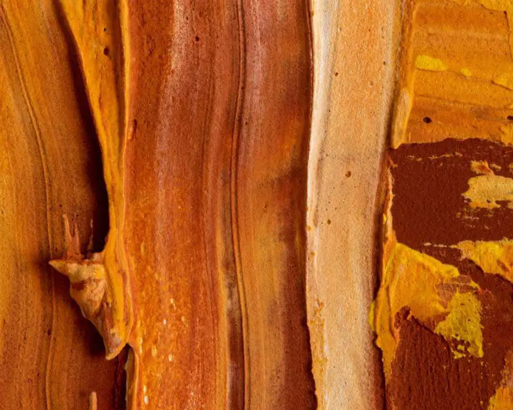
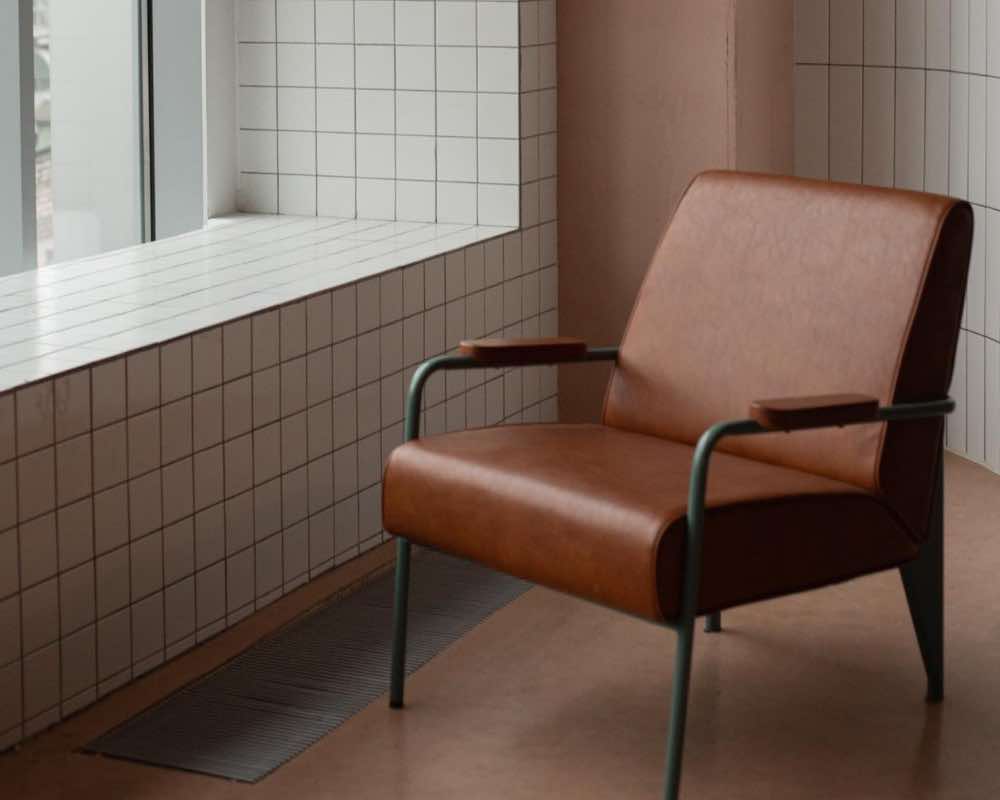
Brown in Landscape Paintings
Brown is a very important color in landscape paintings. Mostly, it is used in multiple tones, tints and shades for the ground (soil or sand) and even for creating light and shadow effects on trees.
did you know?
a brunaille painting
Did you know that a painting made only with shades of brown is called brunaille? You can create lighter tints of brown by mixing white paint, and darker shades by mixing black paint.
If you’re looking for something unique in brown, try out this amazing gloss acrylic paint !
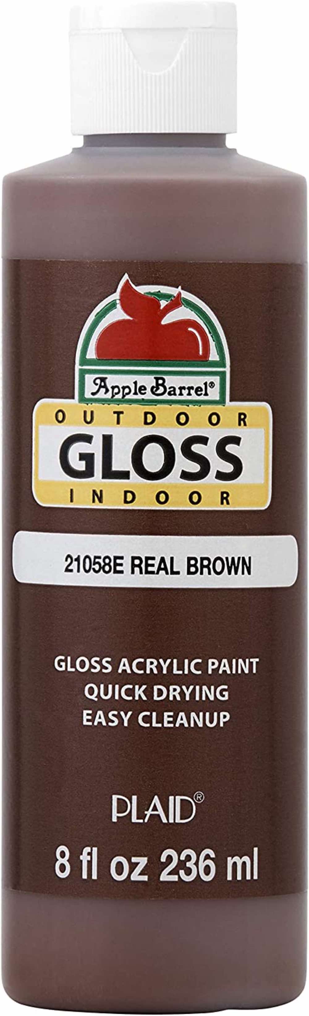
Apple Barrel Gloss Acrylic Paint
This 8 oz bottle of glossy brown acrylic paint will create stunning monochromatic paintings or even tiny decorative artworks.
![]()
5. How is Brown Used in Drawing?
Shades of brown are considered classic in drawing media.
Brown creates simplified yet classic drawings. The color has been used in many master drawings of the past.
In a drawing, shades of brown convey neutral and soothing feelings. Regardless of the media, you’re using, you can get a proper complete drawing using varying shades of brown. Just like a painting created with brown shades is called brunaille, it’s the same case with drawing.
Using brown in various drawing media
Pastels and Chalk: Shades of brown have been around in classic media such as chalk. Sanguine and sepia are two major examples, where sanguine is a warmer and more orange shade and sepia is darker and cooler.
Ink: It’s the same case with ink, where among illustrators, the sepia shade is as popular as black. It adds a classic appeal to ink drawings, so if you love the traditional effect, sepia brown ink might be the right pick for you!
Colored pencils: Shades of brown in colored pencils can be used easily to create skin tones. Blending different hues together can create earthly effects.
Drawing pens: You can get a complete set of brown pens for creating brunaille drawings. Otherwise, you can also find multiple brown hues in a colored drawing pen set.
Wax based/Oil pencils: Brown is a classic color and therefore you can find varying shades of it in oil or wax-based pencils.
Markers: With translucent markers, you can overlap multiple layers of the same brown hue. To add more variety, you can add various layers in different hues of brown too. If you don’t have brown, try overlapping a shade of orange and blue instead and you’ll get your desired result!
Sepia brush pens: Packs of brush pens are available exclusively in brown tints and shades. It provides great tones for working on a landscape.
If you’re looking forward to working with many shades of brown, we highly recommend you get this set of chalks .
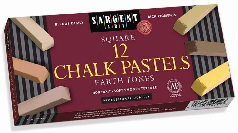
Sargent Square Chalk Pastels (12)
This set of 12 square chalk pastels contain a wide range of brown tones and shades.
![]()
6. How is Brown Used in Design?
An earthly color that evokes the soothing feeling of nature.
Since brown is a neutral earth color, it can put the ‘natural’ effect into any element. Whether it’s in clothes or interior design, using any tone or shade of brown can help create a more comfortable and relaxing environment.
- Using too much brown in one space may cause a lack of sophistication.
- To avoid a monotonous design, use varying tints and shades of brown.
- Use brown in places where you want to give the natural wood effect but don’t want to utilize actual wood.
- Add hints of brown in small, cramped places to instantly make the space more lively.
PRO-TIP
Combine with neutral colors
In design, use white or black along with brown to add depth and variety to the atmosphere. Designing an all-brown space could get suffocating, especially if different tints and shades aren't used.
7. 10 Common Brown Hues to use in art and design
If you're a bit confused about the brown hues you wish to use, here are 10 extremely common ones!
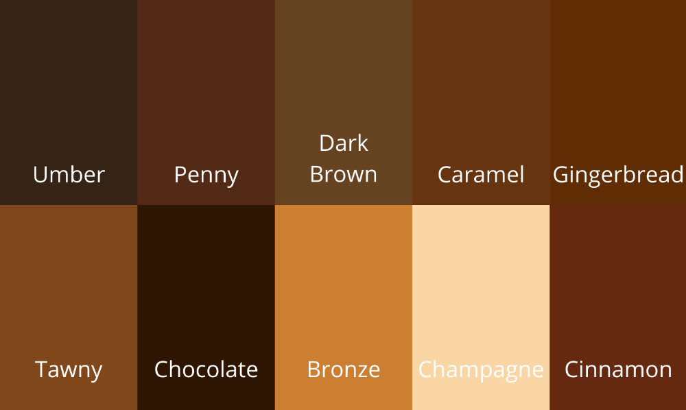
- Umber #352315
- Penny #532915
- Dark brown #654321
- Caramel #65350F
- Gingerbread #5E2C04
- Tawny #80471C
- Chocolate #2E1503
- Bronze #CD7F32
- Champagne #FAD6A5
- Cinnamon #652A0E
Conclusion
If you want to have more power over the resulting shade of brown, choose your orange and blue accordingly. If you want the brown to be warmer, adding a warm orange to the mix will be the best choice. If you want the brown to be cooler, you will need to add a cool blue to the mix. In drawings, paintings, and designs, brown is the ultimate choice to create neutral and toned-down effects. You can also If you don’t know which brown hue you want to create, you can refer to the 10 most common hues of brown.
Do you have a never ending love for colors? Don’t miss reading about this awesome shade created by mixing red and pink!
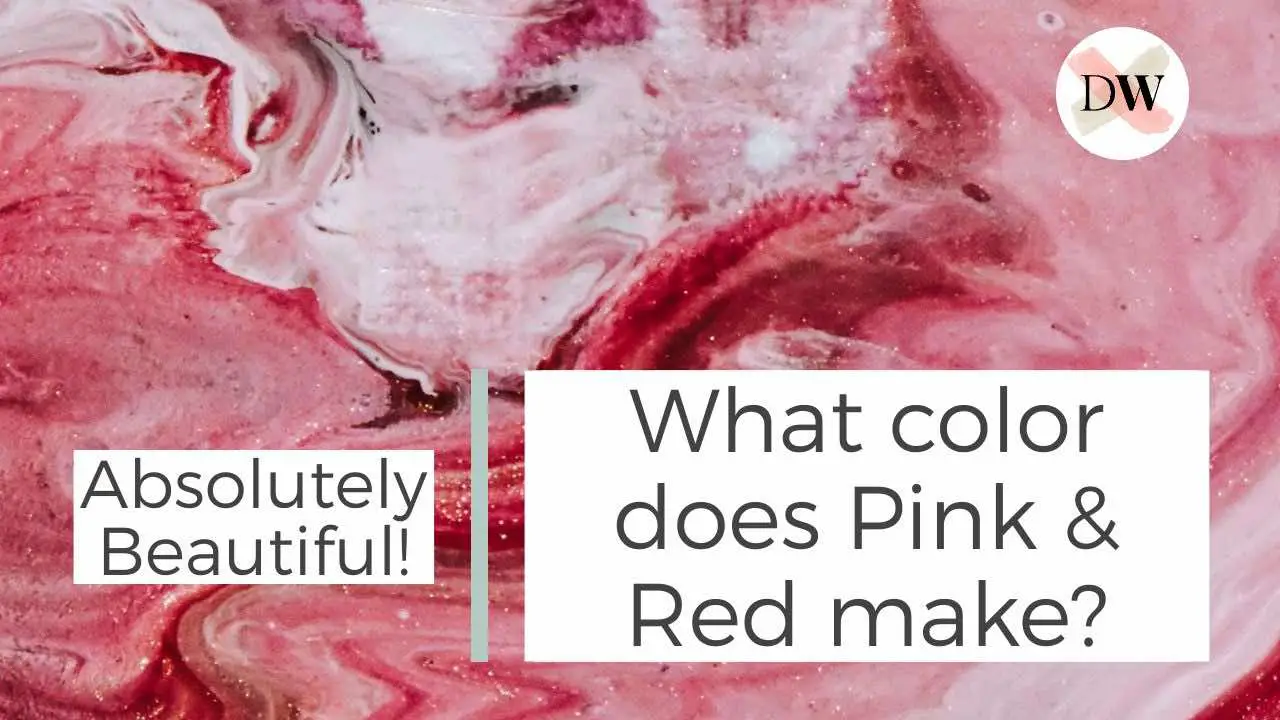
What color does Pink & Red make? Absolutely Beautiful!
Pink and red are both warm colors, invoking a happy feeling. But what color do they make when mixed? Learn about it here!

By Jimena & Iñigo
The Navarro-Rubios
My husband and I are learning how to draw and paint. We wanted to share this learning process with the world and have fun! That's why we created this blog. We'll have drawing contests every week and you'll decide who won that week! Follow along and learn with us!
Jimena & Iñigo
The Navarro-Rubios
My husband and I are learning how to draw and paint. We wanted to share this learning process with the world and have fun! That's why we created this blog. We'll have drawing contests every week and you'll decide who won that week! Follow along and learn with us!
Newsletter
Recommended: