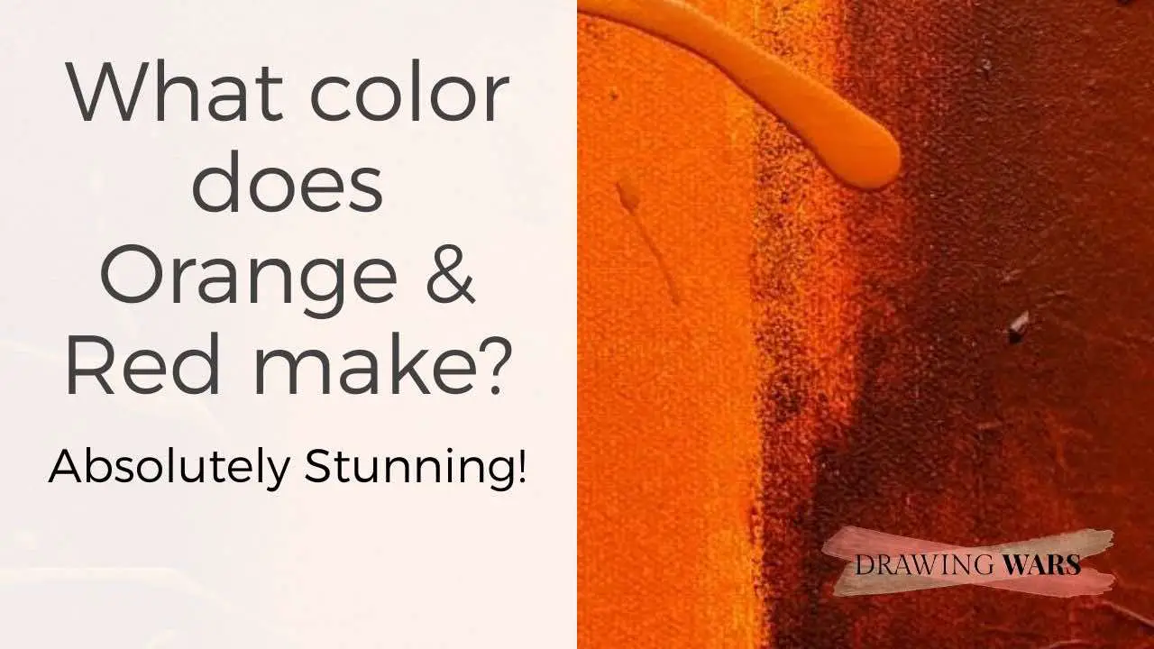
Orange & Red: An Introduction
Orange and red are two of the warmest colors on the color wheel. So the impact they have on us makes sense - they look bold and joyful at the same time. If you want to make any space pop, red has the most extreme wavelength. The one major difference between orange and red is that red is a primary color and orange is a secondary one made of yellow and red. Confused? Don’t worry, read on to see how orange and red create a beautiful color when mixed!
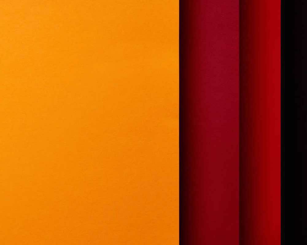
Mixing the primary color red and secondary orange will give you red-orange. The resulting red-orange depends on the orange and red hues being mixed. For instance, cadmium red would produce a bright red-orange, whereas using alizurun crimson red hue would make a toned-down red-orange.
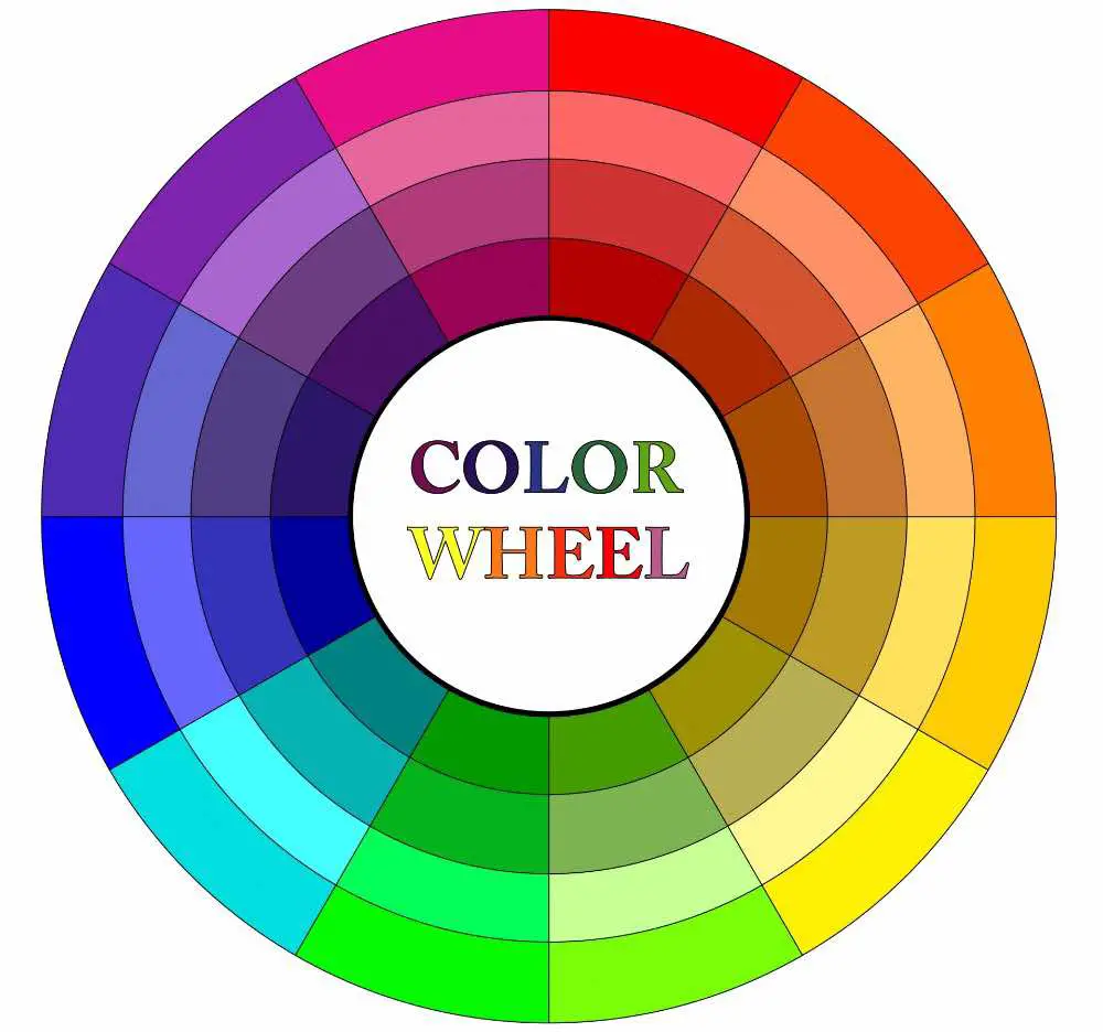
1. Understanding the Color Wheel and Color Theory
On the color wheel, red and orange are warm colors!
Yellow and red - both are primary colors. When these two colors are mixed, they create orange. Hence, orange is a secondary color and it can be found on the warm side of the color wheel as both yellow and red are warm.
Types of Colors
The primary colors are known as red, yellow, and blue. These colors cannot be made from any other color, but they can be used to create a wide range of hues by color mixing. When this happens, the resulting color is known as a
And when you mix one primary color with another secondary color, you get a tertiary color . So red-orange is actually a tertiary color because orange is
PRO-TIP
tints, tones, and shades
Neutral colors like white, grey, and black can be used to vary the lightness and darkness of any hue. It is important to have varying hues because otherwise, you can't create contrast or interest in any art or design project.
Creating tonal values
Let’s look at creating tonal values in a bit more detail. While white, grey, and black are great choices, you can create dark colors even by mixing a particular color with its complementary color. For instance, if you have red, you can mix a bit of green into it to create a dark red hue.
Other than that, here are tints, tones and shades in detail:
Tints: A tint is made when you add white to color. It’s necessary to create highlights and apply the color where you want to show light.
Tones: You can get the tone of a color by adding grey to it. This is great for creating mid-tones, where you have to show a bit of shade but not necessarily complete shadow or darkness.
Shades: Adding black to a hue will create its shade. It’s the best way to add shadows and depth but remember to add black in little quantities because there’s a risk of overdoing it any many art media. Mixing black with lime-green would also tone down the hue but it would always be darker than creating a tone.
PRO-TIP
cool and warm oranges
To make an orange cooler, you could add a bit of blue to it. However, blue is the complementary color of orange, so it could make it darker too. So you can add a pastel blue instead of using dark blue.
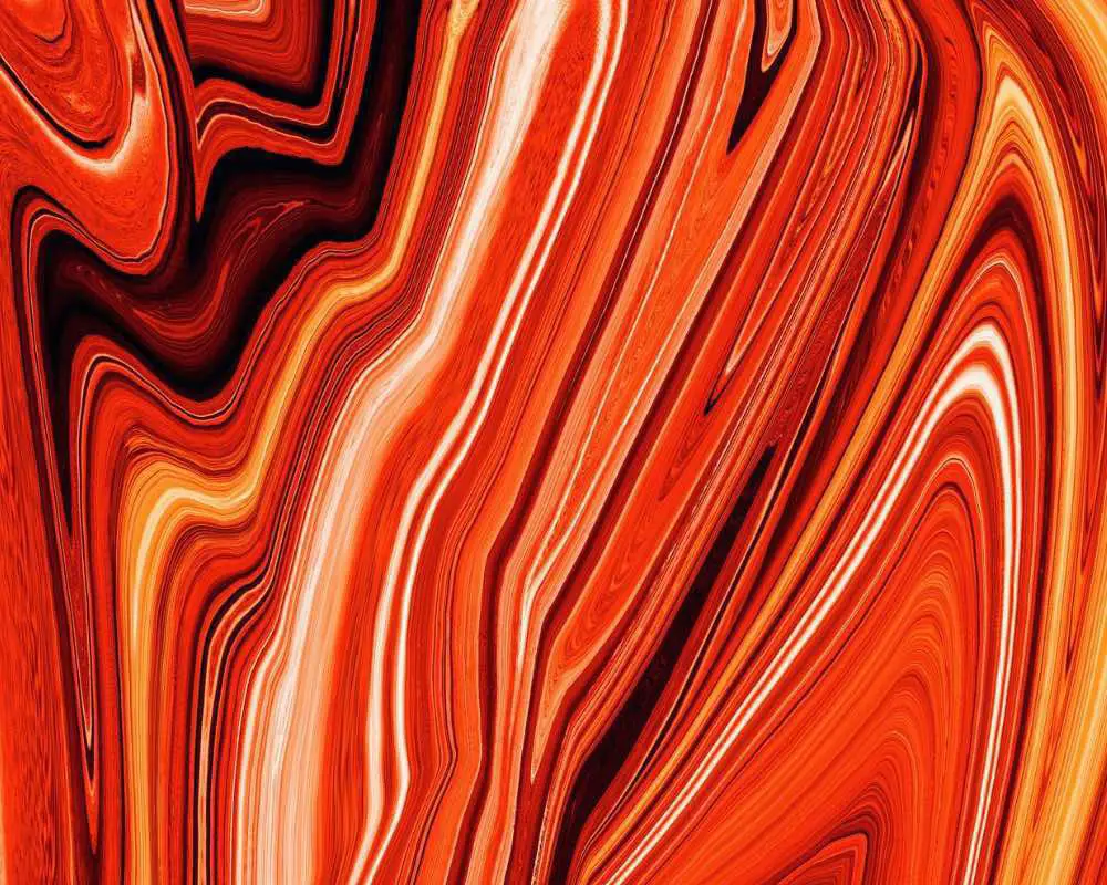
2. Creating hues of Red-Orange using Orange & Red
Adding a bit more red or a bit more yellow will give you many red-orange hues!
What happens if you add more red to the red-orange mix?
Adding more red to red-orange would incline towards red. Since red-orange is already warm, it would only make the hue warmer .
Here are some red hues you may have in your painting or drawing kit:
- Cadmium red
- Scarlet red
- Alizurin crimson
What happens if you add more orange to the red-orange mix?
Keep in mind that orange is a secondary color. So when you’re adding more orange to the red-orange, you’ll basically be mixing both red and yellow. So
Here are some orange hues you may already have:
- Vermilion
- Carrot orange
- Burnt orange
So whether you’re adding more red or more orange, the resulting hue will be warmer. But if there’s more yellow, your red-orange could look brighter as basic yellow is usually brighter than the basic red.
3. What is the color psychology of Red-Orange?
Red orange is a mix of red and orange, so it contains a tinge of yellow too.
When you think about red-orange, don’t forget to leave yellow out of the picture! Yellow is a very youthful and happy color, . And to make orange, it’s necessary to have yellow in the mix. You can’t have orange without yellow in it. You’ll have to mix red and yellow to get an orange hue, you can’t create orange with another primary color.
Red-orange is a very intense color. It consists of the psychology of red and yellow. Where red stands for boldness and aggression, yellow has more fun and bubbly effect. By adding more red to orange, you would be inclining it towards a bold and powerful feeling.
| Positive traits | Negative traits |
|---|---|
| Playful | Rudeness |
| Energetic | Frivolity |
| Engaging | Crasness |
| Health | |
| Vitality |
Although red-orange represents the above positive characteristics, remember that the meanings could vary from one culture to another. The symbolic meaning of any color is usually created over a certain span of time.
If you want to see how colors can effect cultures, have a look at this guide.
4. How is Red-Orange used in painting?
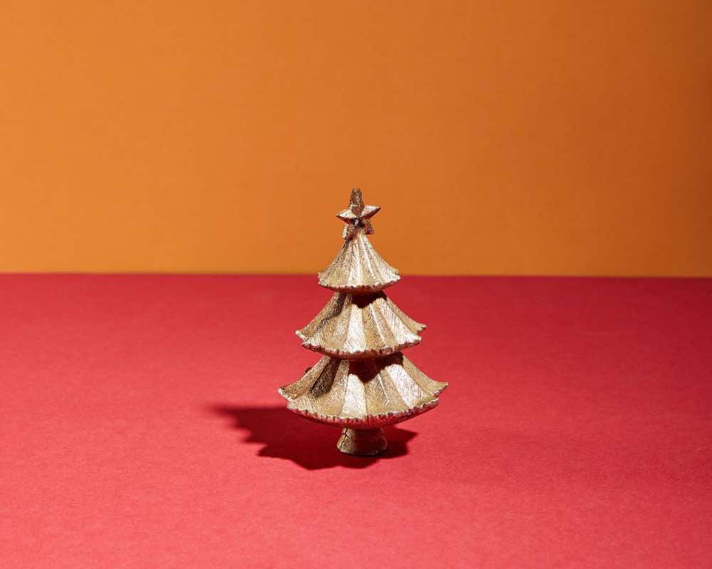
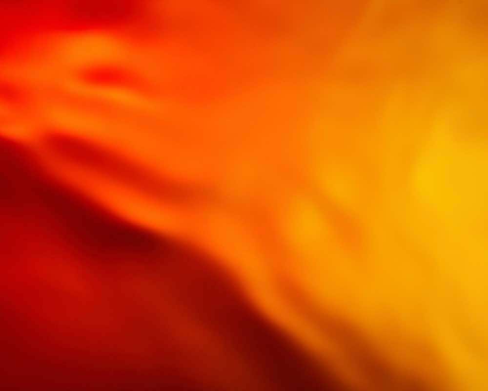
With red-orange, you could create a warm atmosphere in painting.
If you want to make a calm and cool painting more vibrant and happening, red-orange is your color.
By using red-orange in any painting, you could also give the effect of sunshine. Note that the effect of red-orange may vary from one painting medium to another. It’s a color that hasn’t been used much in traditional paintings unless it has been toned down. Due to its vibrancy, it makes for a perfect hue in expressive artworks and modern art. So if you prefer a more modern approach to painting, don’t forget to add red-orange in your warm color palette!
5. How is Red-Orange used in drawing?
Red-orange can be used to create subtle warm highlights and warm shadows.
In drawings, you could add red-orange in case you’re showing cool light.
Using only red-orange isn’t very common. If you want a traditional approach to using red-orange, we suggest you use it for adding warm highlights or warm shadows. In the case of shadows, you would need to make the red-orange darker by adding a bit of black or the complementary color, blue.
You could also make the orange cooler and use it in an autumn-themed drawing. Usually, shades like burnt orange work really well with rustic and brown earth shades.
Using purple in various drawing media
-
Chalks and pastels: With pastels and chalks, you could create a wide range of red-orange hues instantly.
-
Inks: Inks can either be transparent or they could be permanent. If you want to create a lime green hue, take a separate container or well. Using an ink dropper, put some canary yellow or bright yellow into the well. Then add a bit of viridian green and you’ll have a stunning yellow-green! To go darker, we suggest adding just a tiny bit of brown or if you’re using transparent ink, use multiple layers to intensify your marks.
-
Colored pencils: Pick two hues - one yellow and one green. The green colored pencil could even have a dark hue. Since yellow is lighter, use it first to fill in the color. Then add green on top of it and use a blender pencil to create yellow-green. You could also use yellow and green colored pencils in strokes of opposite directions over one another, without using a colorless blending pencil.
-
Brush markers and pens: When it comes to red-orange, you can use a variety of dark red shades on top of the red-orange brush pen marks.
If you’re looking for a drawing pencil set with earth shades, get your hands on this pack because it has neutral colors too.
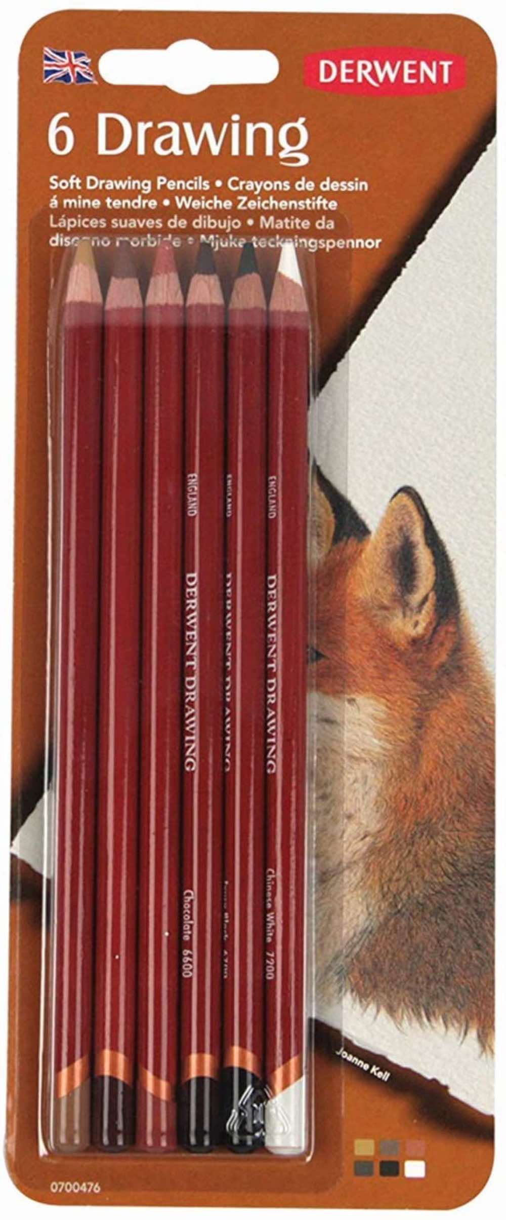
Derwent Drawing Pencils
This set of 6 pencils had a red-orange brown type shade that will add a brilliant warm touch to your drawings.
![]()
6. How is Red-Orange used in design?
If you have a dull room, add a bit of red-orange to pop it up!
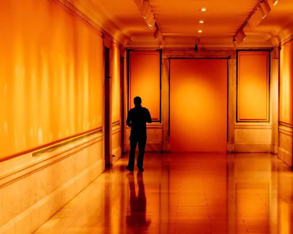
Red-orange in design can make a powerful impact, while adding vibrancy and joy to any room.
Using red-orange in design could get a bit tricky. It’s warm and it is extremely outgoing, so you may have to tone it down using a neutral color. Or you could even use a neutral color side by side with it, since red-orange usually has more red in it and the bold expression could look way too much to handle.
So here are a few ways to handle red-orange in your design:
- If you have a dark red-orange hue, pair it with a color that is much lighter, for instant, white.
- When using a lighter version of red-orange, pair it with a dark grey or dark brown. Any dark hue would look great.
- For a highly energetic mood, you could pair your red-orange with a yellow ochre or any other slightly toned down version of warm
PRO-TIP
avoid metallic colors
Metallic colors like silver, gold, and bronze look amazing. However, when you're using a very strong red-orange, these colors may look too demanding and overwhelming. Pair these with red-orange only if you want a super glamorous and over-the-top look.
Colors that go really well with red-orange
Red-orange is an inherently bright color. So it only makes sense if you add a complementary color beside it or some neutral colors like grey, white or black. But there’s more than just blue-green (complementary color of orange) and the family of neutral colors.
Here are a few colors that you can put along side red-orange and they’ll look awesome!
- Green
- Yellow ochre
- Biege
- Blue
You could combine different values of red-orange too but that would give you a monochromatic scheme. Monochromatic schemes usually don’t have the ‘pop’ element but look harmonious, so if you want that look, don’t hesitate to go for it.
7. Some of the most common hues of Red-Orange
Red-orange hues could lean either toward red or toward orange.
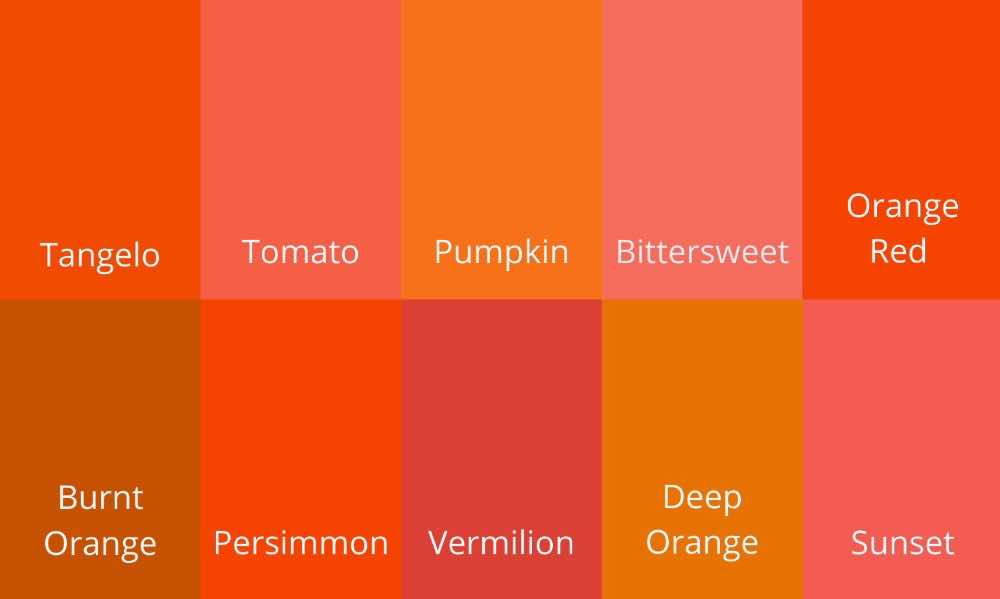
Are you feeling confused? Don’t worry, here are some of the most common hues of red-orange.
- Tangelo
- Tomato
- Pumpkin
- Bittersweet
- Orange Red
- Burnt Orange
- Persimmon
- Vermilion
- Deep Orange
- Sunset
Keep in mind that these are not all the hues of red-orange. You could play around with the tonal values of each of these hues too.
Conclusion
Hence by mixing red and orange, you get a stunning hue of red-orange! But in order to have more contrast and a wide range of hues of a specific color, you should add white, grey, or black to create tints, tones, and shades. Red-orange has more of the effect of red, so it’s bold and vibrant and the touch of yellow in orange adds a cheerful appeal to it. So you can use it in your artworks and designs to create warm and outgoing subjects. In deisgn, it’s best to pair red-orange with something darker, but if your red-orange hue is dark, choose a lighter color instead.
Do you wish to explore more colors? We suggest you read this post on the color mixing of blue and pink !
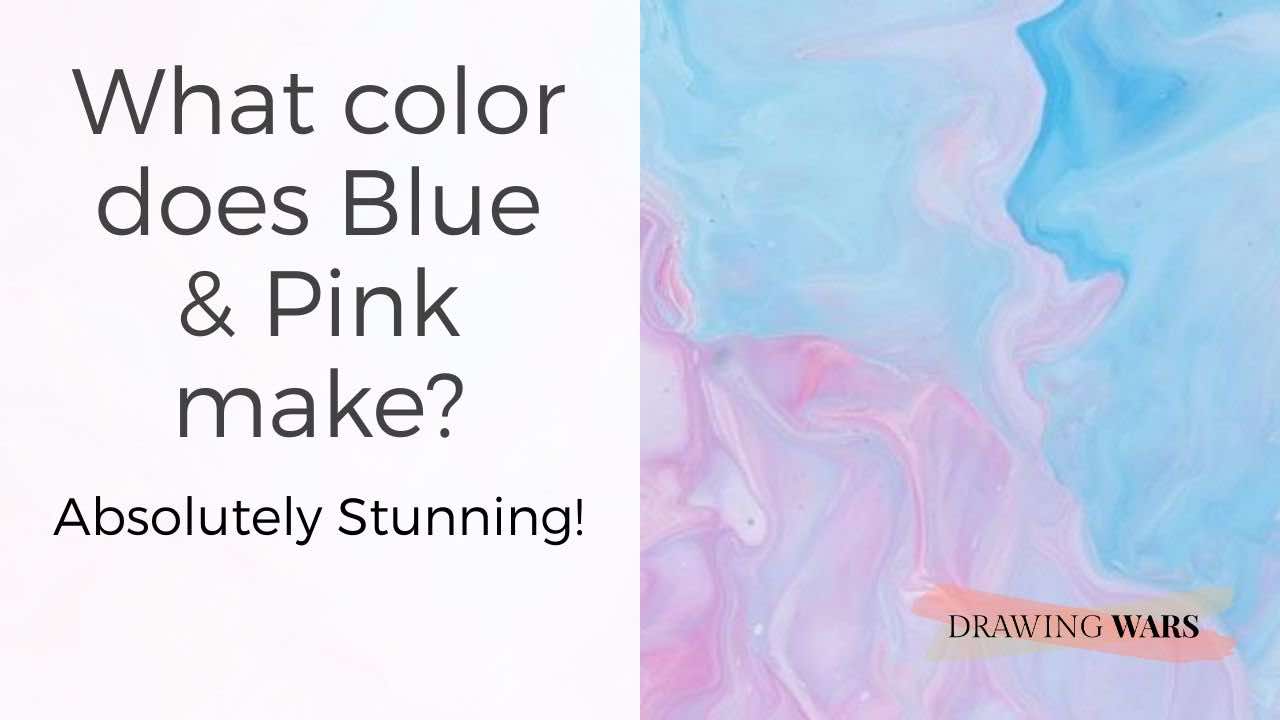
What color does Blue & Pink make? Absolutely Stunning!
Blue is a primary color, while pink is a tint of red. So what do they make when they are mixed together? Have a look at this beautiful color!

By Jimena & Iñigo
The Navarro-Rubios
My husband and I are learning how to draw and paint. We wanted to share this learning process with the world and have fun! That's why we created this blog. We'll have drawing contests every week and you'll decide who won that week! Follow along and learn with us!
Jimena & Iñigo
The Navarro-Rubios
My husband and I are learning how to draw and paint. We wanted to share this learning process with the world and have fun! That's why we created this blog. We'll have drawing contests every week and you'll decide who won that week! Follow along and learn with us!
Newsletter
Recommended: